Maria Longley, GiGL Communities Manager
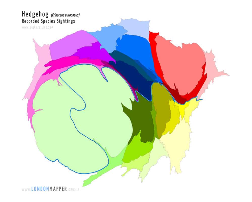
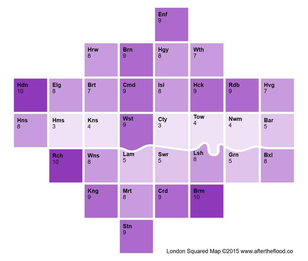
The number of hedgehog records for each London borough, where the boroughs are distorted so that the one with most records appears the largest. It’s important to remember that the number of records can be influenced by recorder effort as well as species abundance.
At the Open Data Institute Summit in November, I was struck by how many speakers said that people are not that interested in data but rather in the answers it can provide. Raw data is only ever going to be of interest to a small percentage of people and so data visualisation is going to be a key way for us to share biodiversity information with a wider audience. Some of the most passionate conversations we have been having as a team have revolved around dreaming up different ways of presenting GiGL-held data.
Interpreting data has always been part of the suite of services the GiGL team offers, as has presenting data on maps, and who doesn’t love a good map? But recently, we have been captivated by the power and beauty of data infographics. We have also started dipping our toes into other visualisation opportunities. “Have you seen what this looks like now I’ve turned the data yellow?” we ask each other. “Look what it shows now!” A good data visualisation will engage the audience and impart information, both important aspects of what we do.
-

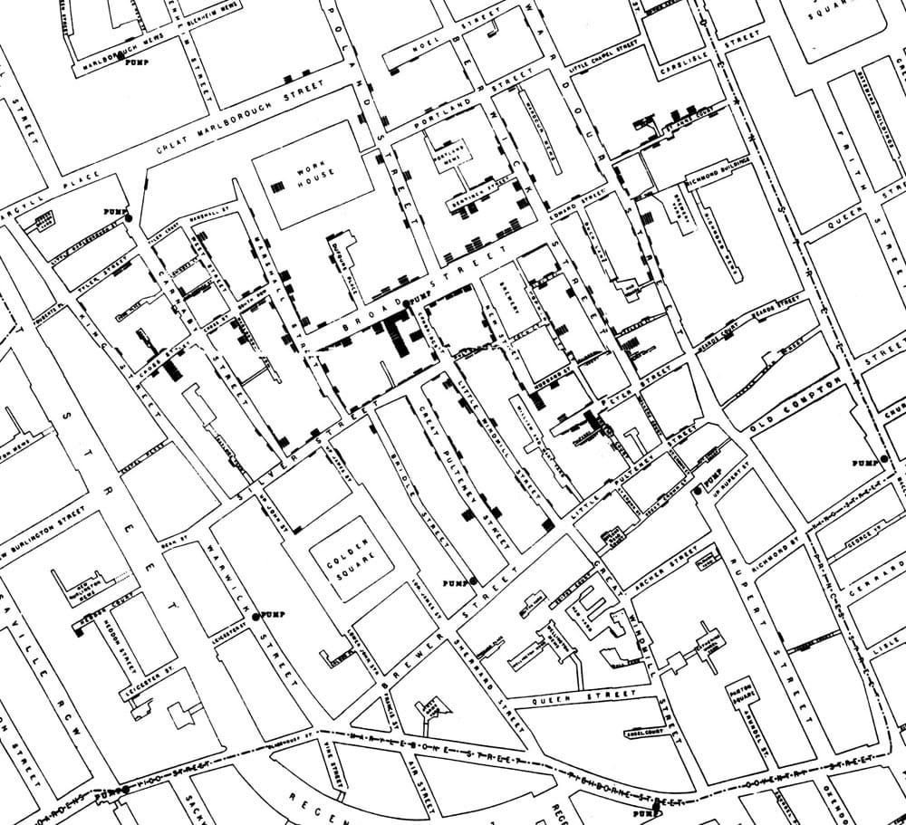
- John Snow’s Cholera Map, 1854
-
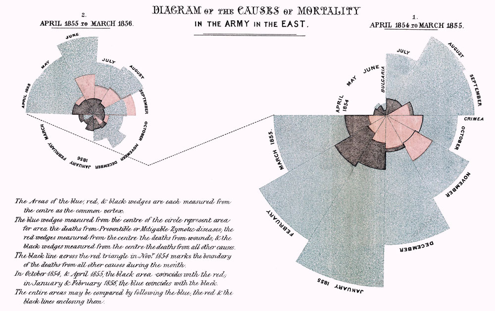
- Florence Nightingale – Causes of Mortality in the Crimean War, 1856
-
- Octavia Hill, Open Space Map, 1888
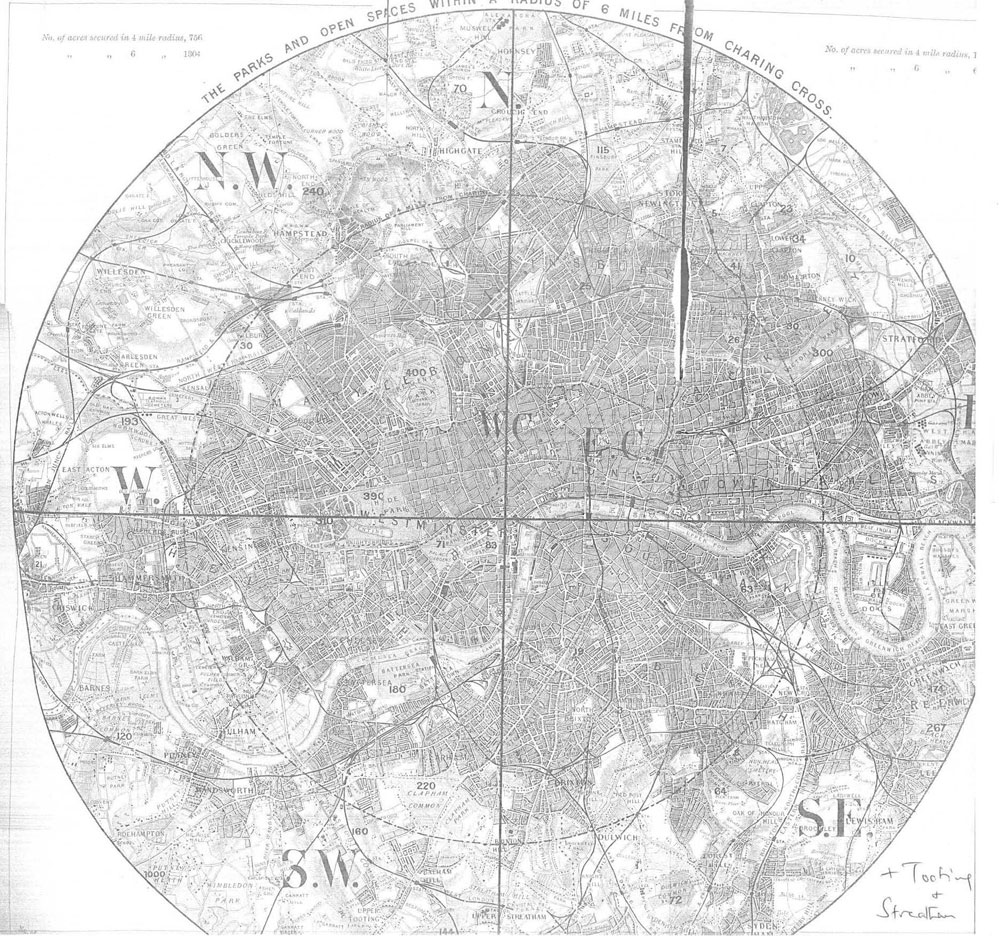
Visualisations of data have long been used to inspire change. Florence Nightingale is credited with creating some of the first infographics; illustrating that the primary cause of patient mortality in the Crimean War was preventable disease. In doing so, she inspired a revolution in healthcare and hygiene in hospitals worldwide, saving innumerable lives. Similarly, by mapping cholera cases in 1854 Soho, Doctor John Snow identified one specific well as the likely source of the outbreak. And Octavia Hill mapped the parks and open spaces in a six mile radius around Charing Cross in 1888 to argue the value of clean air to London’s rapidly multiplying population, highlighting the discrepancy of green space between the impoverished east and affluent west of the city.
A well-thumbed copy of David McCandless’ seminal book “Information is Beautiful” sits in the centre of the GiGL office. So we jumped at the opportunity to increase our visualisation knowledge by sending four enthusiastic staff to David McCandless’ workshops. The workshops took us through some of the principles behind creating effective visualisations and provided a chance to shape our ideas with different styles of data visualisations and how to construct them. We came away looking very differently at the data we work with on a daily basis, and itching to try to interpret it using some of this new visual language. The lively sessions were great and convinced us that data visualisations can make boring data interesting and that they are an important way of communicating information.
Data visualisation allows us to tell the stories behind otherwise challenging datasets. They provide useful information and allow users to explore the data in a fun and efficient way. We’ve enjoyed playing with GiGL partnership data and thinking more creatively about what we can say with it. We can already see ways to share stories and talk around the data rather than just describe it. Visualising data opens up the conversation and leads to new insights as everyone looks at the data with fresh eyes.
Every year, the GiGL team attends the Association of Local Environmental Records Centres (ALERC) conference to share ideas with other records centres across the UK. This year, we took examples of our recent data visualisations to share what we had learned and to get feedback. As records centres, we are all used to collecting data once and using it many times, so this feels like a natural extension of our work. Other LERCs at the conference could see the value of this approach; of delving into data to discover what it might tell us and then sharing those insights.
-
- Visual representation of the number of bat species recorded in each London borough
-
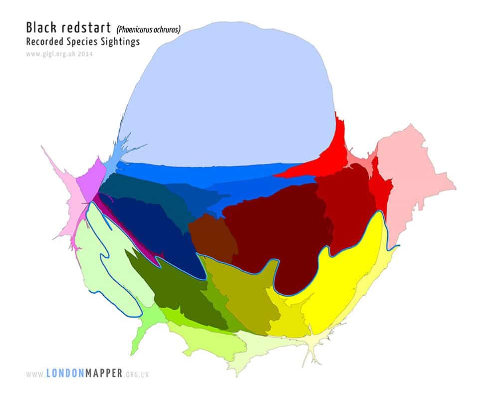
- The number of black redstart records for each London borough, where the boroughs are distorted so that the one with most records appears the largest.
-
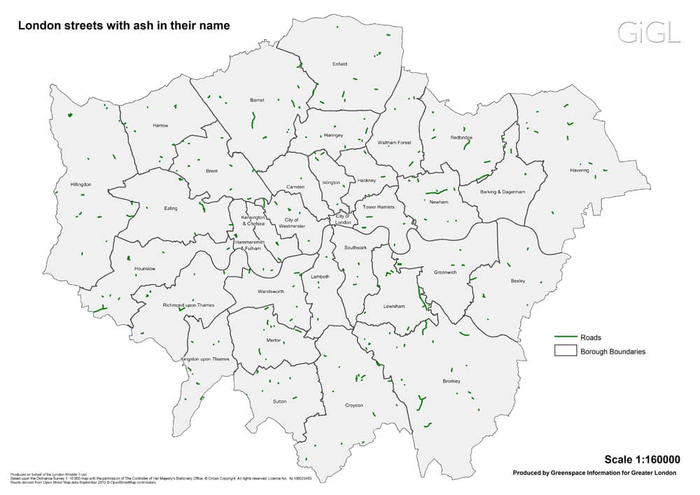
- Many open spaces and species appear in street names. This map shows the locations of streets with ash in their names.
Data visualisations are often very beautiful in their own right, but their real value is in making the data work. We would like to expand our visualisation experiment, to talk to GiGL partners and other data providers and users to explore how we can use these tools to help you tell your stories. So please do chat to us if any of this has sparked your imagination. We are also hoping to incorporate more visualisations in our day-to-day operations and to add more story-telling to our outputs.
Jonathan Walker, Data Enthusiast
I have long wanted to use my mapping experience to present wildlife data, and so combine two of my interests. When I contacted GiGL to request data for the purpose I was greeted with a welcoming and open attitude to data sharing. Under GiGL’s public data use licence, I was provided with a comprehensive temporal and geographic dataset of stag beetle sightings per year, by 1km grid square, within Greater London between 1986 and 2014. My jaw dropped. It was perfect for the type of map I wanted to create.
GiGL provided the data in a CSV file which took no manipulation to feed into Excel. The animated map was created using the Microsoft Excel PowerMap add-on; an excellent tool for producing animations from simple and complex data sets. The map is animated to show peaks in different areas of Greater London and the frequency of sightings by year between 1986 and 2014.
I was incredibly impressed by the stag beetles species action plans in place across London. For example, the London Borough of Richmond action plan is well established and the data shows the importance of the work done by this organisation. Reported sightings are declining and by donating my time I hope it might just make a little bit of a difference to help this wonderful species of beetle. If someone sees the map and thinks, “I’m going to do something to help preserve this fascinating species” then it will have achieved its aim.
Maria Longley is the community manager at GiGL and has enjoyed the recent opportunity to play with data while working on visualisations. Maria is also thinking about starting an Octavia Hill fan club some point soon.
Jonathan Walker works in business intelligence at North Yorkshire County Council. His work and his interest in wildlife have rarely met, until now. With over 20 years experience in mapping and research, and a love of nature and animals since childhood, Jonathan hopes to merge these interests in the future to help understand and preserve species.