Andy Foy, GiGL Systems Manager
Data is dull, isn’t it? It’s just a load of facts and figures collected together, a series of ones and zeros that don’t seem to be worth paying much attention to. But when it is presented in the right way data really comes alive. It is possible to convey a whole story in just one image that is simultaneously accurate, revealing and persuasive. As they say, “a picture paints a thousand words”.
Some of the GiGL team recently joined a virtual seminar presented by David McCandless, the founder of Information is Beautiful and author of the book of the same name. During the one-day webinar David explained his process and method for creating successful data visualisations and infographics. We learnt how to take a concept and a set of data, select an appropriate and effective way of presenting it, and then design and create an informative, engaging and effective visualisation. But more than that, we were inspired by the incredible array of data visuals David presented and the story they told.
It’s not often that I attend a workshop or seminar and come away feeling so genuinely energised and excited about the world of data. Data underpins our existence at GiGL. It is what we do. We work with it day after day: collecting it, improving it, analysing it, and sharing it as widely and as effectively as possible. Being able to visualise and present data in the most appropriate way for every audience is our challenge, and now we have been inspired there’ll be no stopping us.

Community Officer
The ability to communicate effectively is essential in any community facing team. We need to take the vast amounts of data available in our databases and synthesize it into easily digestible and useful outputs for the general public. Communication is most effective if it is eye-catching whilst being simple to understand. You’re much more likely to stop scrolling and read an infographic if it has a fun, initial draw factor that entices you to find out more. However, it isn’t enough just to be eye-catching – an infographic has to be useful, so it is the balance between the two that makes a good infographic great. The workshop inspired me to explore our data holdings in a new and vibrant way.
We produce a lot of outputs for GiGL’s social media so having the ability to create exciting infographics really helps to spread awareness of our work and allows us to share data with a wider audience. A key point of David’s presentation was the use of previous infographics to generate ideas for new ones, a top tip that has encouraged us to try something a bit new. Since the workshop we’ve been trying our hands at playing around with GiGL data using https://rawgraphs.io/, a brilliant website that allows you to create quick data viz, which was recommended to us by the Information is Beautiful team.

Partnership Officer
Whilst the Information is Beautiful process often starts with the idea of an image and what it would look like, and they then go and find data for it, we usually have the data already and are working out how best to display it. The core principles they gave for good data visualisations, however, remain the same: data, concept, goal and design. In my work at GiGL, I find that getting clients to clarify the goal and concept is vital to choosing the right datasets to use and the best design for displaying them, and often helps clarify other aspects of the work along the way. Why do they need the map/data/image? What will it show? Who is it for? What is the question that it will answer?
Maps are a particular type of data visualisation that form a large part of what we do, but did not feature much in the workshop; it was a helpful reminder to consider occasions when visualisations other than maps could be most powerful. Below are a couple of images where we have employed this in the past, and I would like to do more of these kinds of visualisations in the future.
Reducing visual clutter was one of the themes that chimed with what I’d noticed in my own work; maps and charts that show only what they need to, as simply as possible, are easier to interpret – and more beautiful.

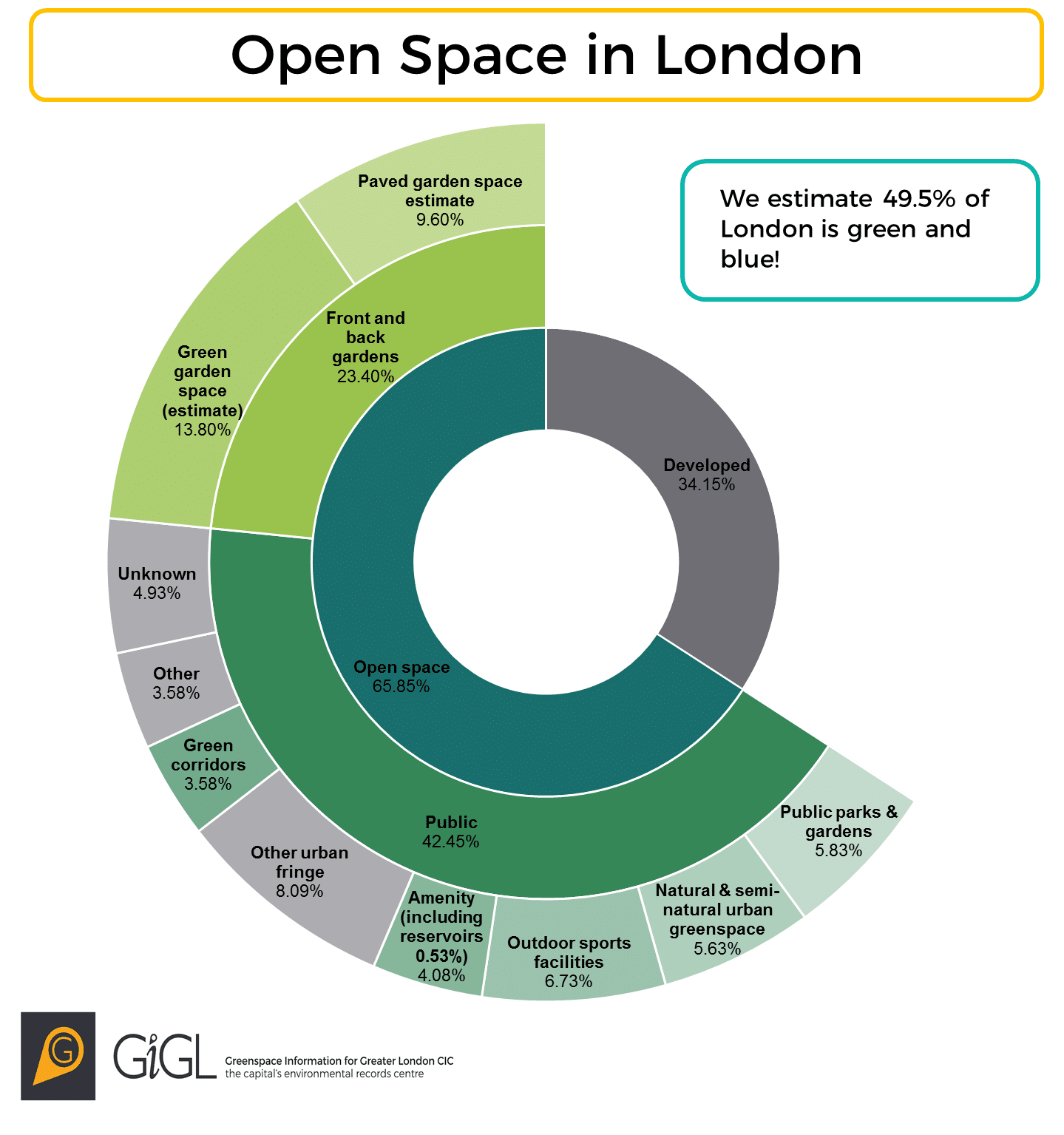
Open space visualisation used on the London National Park City Map (c) GiGL and Urban Good CIC 
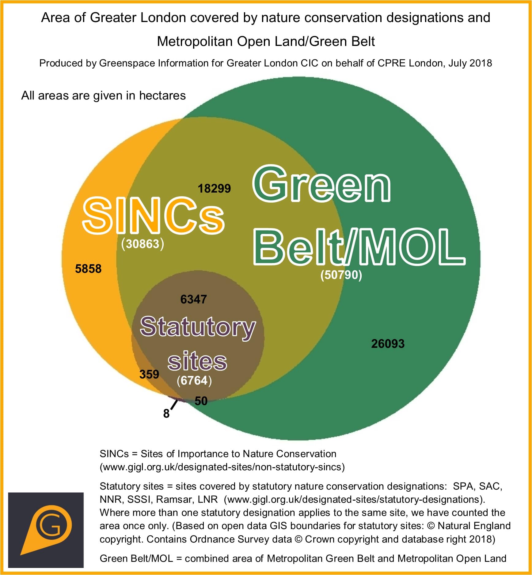
Venn Diagram GiGL produced for use within CPRE London’s ‘Protected Land’ report

Database Officer
As a database officer, I often explain our data and databases to our partners and stakeholders. When talking about complex datasets, databases and how these are linked to each other, I like to use different kinds of infographics to help the audience to understand how these work and how they can make the best use of them. As most of our data is spatial, there are a lot of different and creative ways these data can be visualised and presented.
I found the Information is Beautiful workshop very useful and inspiring, it was interesting to see different and new ways to visualise data. GiGL data are used by a variety of different audiences, including architects, land use planners, decision makers, community members and many others. It’s important that the infographics we use are interesting, easy to understand and impactful. Some of the key aspects that are important in data visualisation are similar across different industries and it was interesting to hear views from people with different backgrounds in the workshop.
During the workshop, we went through the visualisation process starting from choosing the data, defining the concept, defining the goal and choosing what kind of visualisation and design to use. I found this very helpful, and it has inspired me to try new ways to visualise GiGL data next time I explain it to people.