
Afield Environmental is a new grant-giving charity responding to environmental injustice. Its two strands of funding are: Nature Communities – funding underserved urban communities to develop green spaces; and Artistic Research – supporting low-income artists to undertake ecological research.
The first open call for Nature Communities grants will launch in October 2026, focusing on applications from a number of London boroughs identified as a priority through working with GiGL. Afield will fund six individuals with ideas to develop new or existing green spaces in community-led projects. The grant will be for £30k per year over 2 years, with the option to apply for a third-year follow-on grant, and Afield will also facilitate a cohort programme to support the group.
Afield realised that there was a substantial disparity in green space available to communities in different areas of London. Their team decided to look at publicly available datasets to create an evidence-based way of prioritising boroughs for support. It became clear that a data map would be a great way to visualise London’s existing nature and green spaces. Because Afield’s mission is to respond to environmental injustice, the team realised that by layering deprivation data on top of green space, they could highlight how the disparity is rooted in broader socio-economic issues.
As part of GiGL’s role as a social enterprise, we believe that supporting social and environmental issues in communities are important, especially when it comes to accessing greenspace information. Therefore, we created an online interactive map to help Afield identify locations where they could target their work.
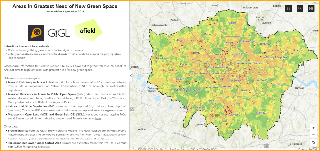
This map includes data on brownfield sites, population estimates and a hexagon grid layer which highlights the areas with greatest need for green space. We modelled this hexagon layer using our data on Green Belt, Metropolitan Open Land and Areas of Deficiency in Access to Nature and Public Open Spaces. Indices of Multiple Deprivation were also used to score the hexagons. A higher score represents a greater need for new green space.
The full approach is outlined in Table 1:
| Table 1: Data and method used to created hexagon layer which represents the areas of greatest need for green space in London. | |||
| Dataset | Source | Description | Scoring System |
| Areas of Deficiency in Access to Nature | GiGL | Areas more than 1km walking distance from an accessible Metropolitan or Borough Site of Importance for Nature Conservation (SINC). Dataset modelled by GiGL. | Score of 1 where AoD was present |
| Areas of Deficiency in Access to Public Open Space | GiGL | Areas more than a specified walking distance from a publicly accessible open space. Split into categories of open space: local, small and pocket parks; district parks; metropolitan parks and regional parks. | Score of 0.25 for the presence of each of the AoD POS categories |
| Green Belt | GiGL | Areas designated as Green Belt within borough Local Plans. | Score of 1 where no Green Belt present |
| Metropolitan Open Land | GiGL | Areas designated as Metropolitan Open Land within borough Local Development Frameworks. | Score of 1 where no MOL present |
| Indices of Multiple Deprivation | Ministry of Housing, Communities and Local Government | The Indices of Deprivation 2019 use 39 separate indicators, which are combined, using appropriate weights, to calculate the Index of Multiple Deprivation 2019 (IMD 2019). This is an overall measure of multiple deprivation experienced by people living in an area and is calculated for every Lower Super Output Area (LSOA) in England. | Score from 0.1 – 1 based on reversing the IMD decile so a score of 1 is given to the most deprived areas |
Also on the online map are brownfield sites from the GLA’s Brownfield Site Register. The sites mapped are only deliverable and not permissioned sites, or deliverable and permissioned sites from over 10 years ago. This was to show realistic locations where green space could be created. Additionally, population density is represented on the map per Lower Super Output Area, and this layer was generated using 2021 census data (Office for National Statistics).
The combination of these three layers allows the user to assess firstly where is most in need of new green space based on the modelled hexagon layer, then cross reference this with the locations of Brownfield sites to select actual locations to assess on the ground for their suitability. Population density adds another layer of useful information to try to target the areas where density is greatest and therefore more green space is needed per capita.
The online map has helped Afield to shortlist eight boroughs for their first Nature Communities call, whilst also giving applicants a clear understanding of how their project is located against the evidence base. This transparent approach supports Afield’s aim to resource those with lived experience of environmental injustice. By creating actionable outputs from environmental data, this work also reflects GiGL’s social enterprise mission to use evidence for environmental and social good, supporting a more equitable and resilient London.